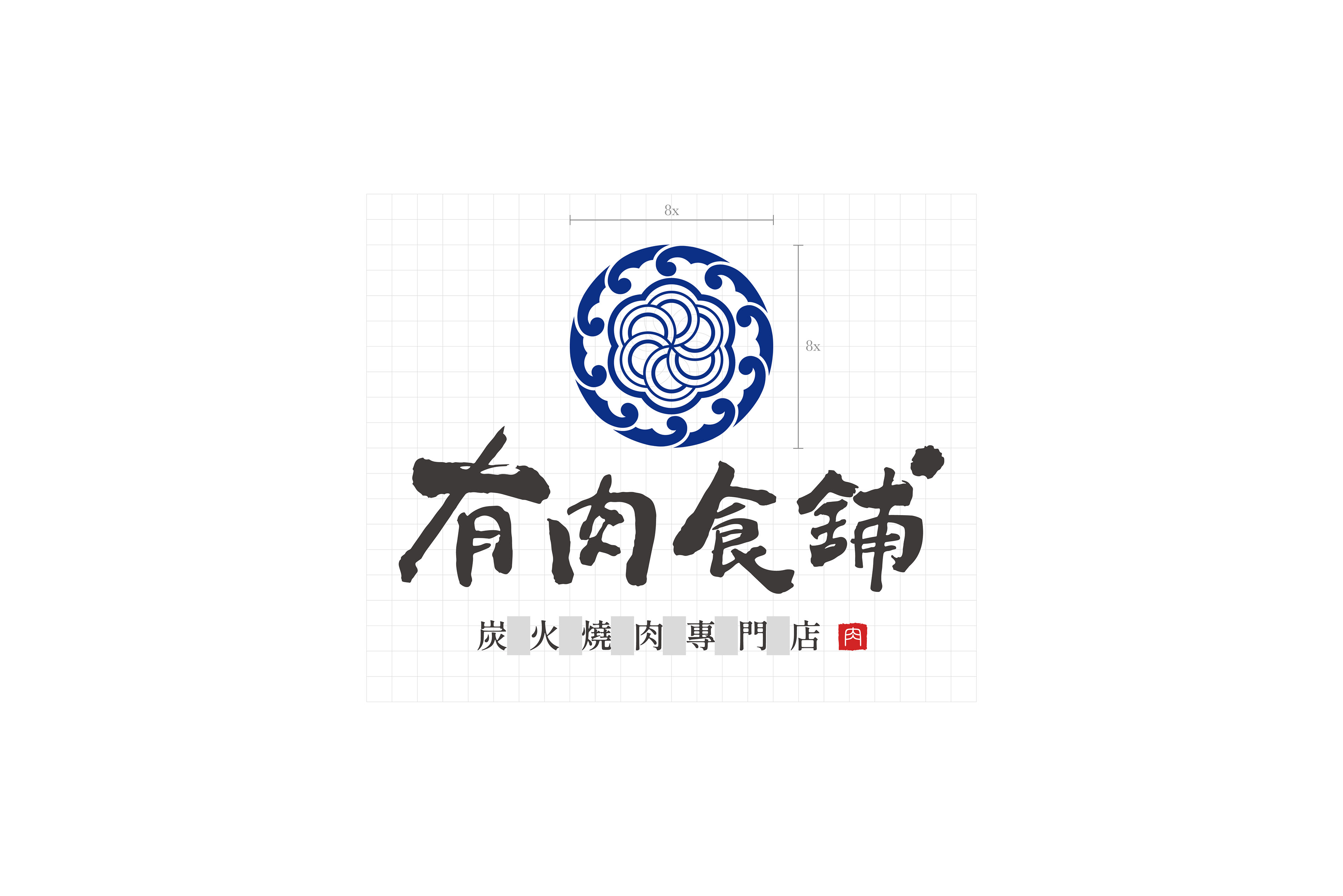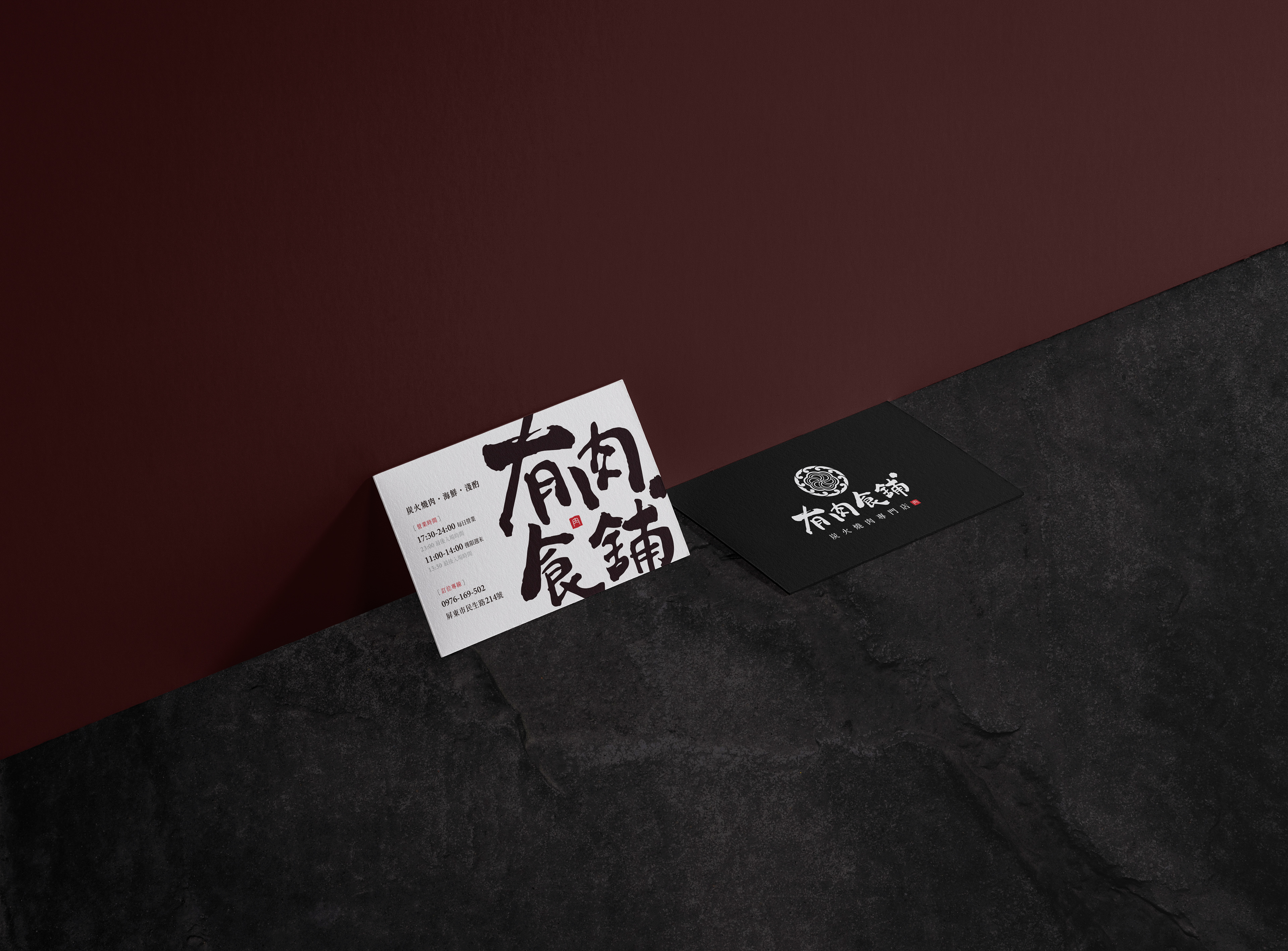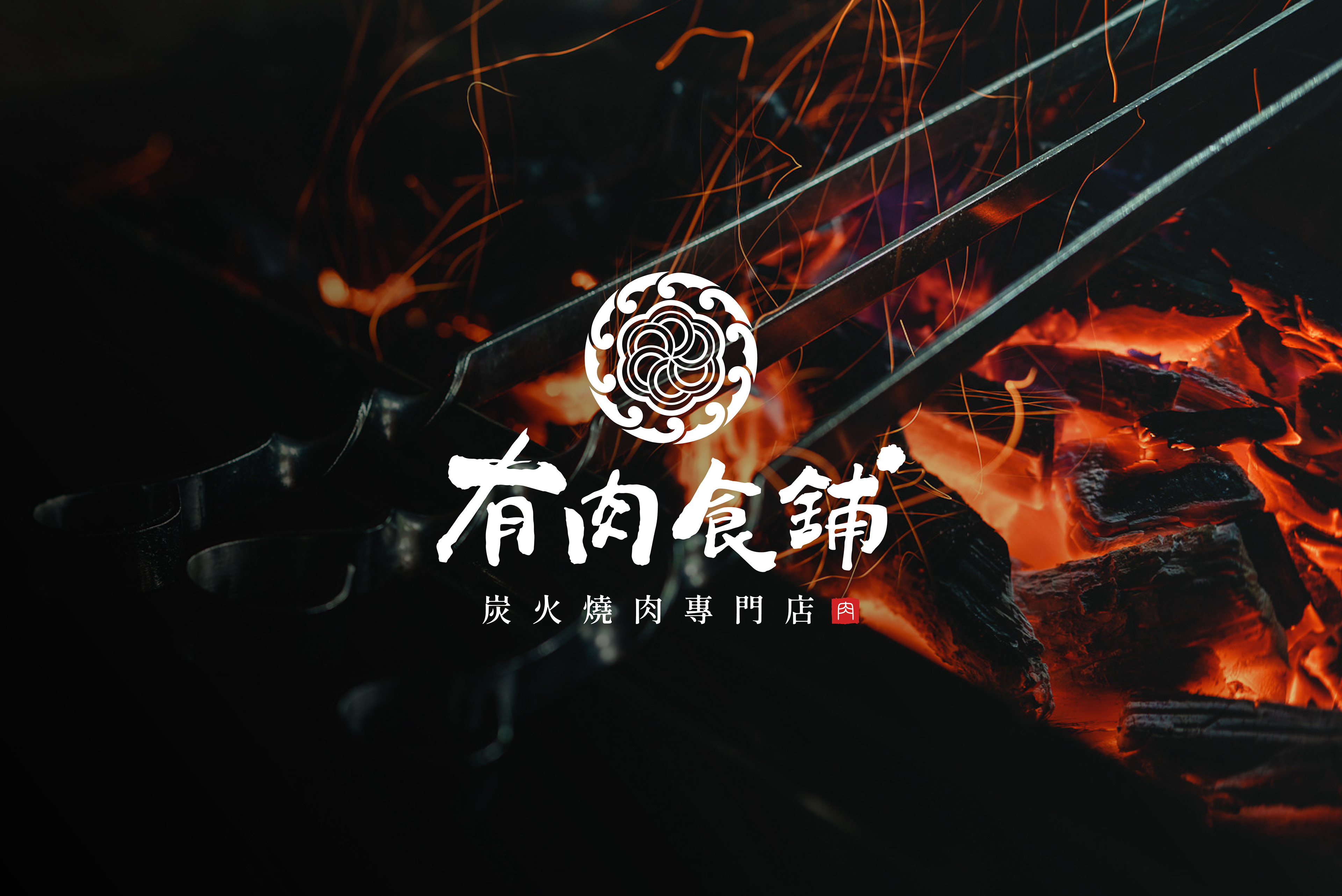
有肉食舖 炭火燒肉專門店 Yoroshipu Yakiniku
Client 有肉食舖
Visual Design Ting-Shan Lin
Year 2019
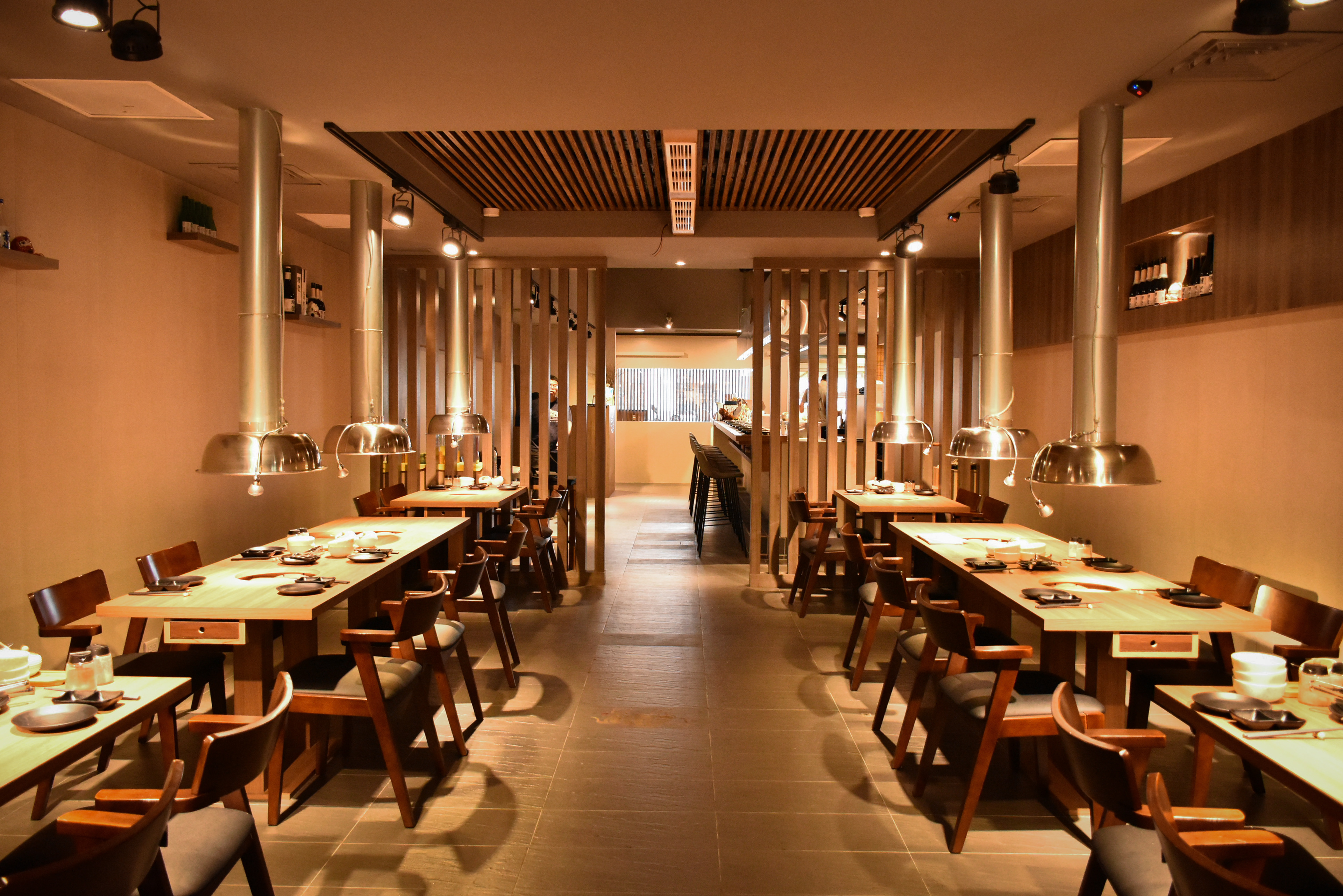
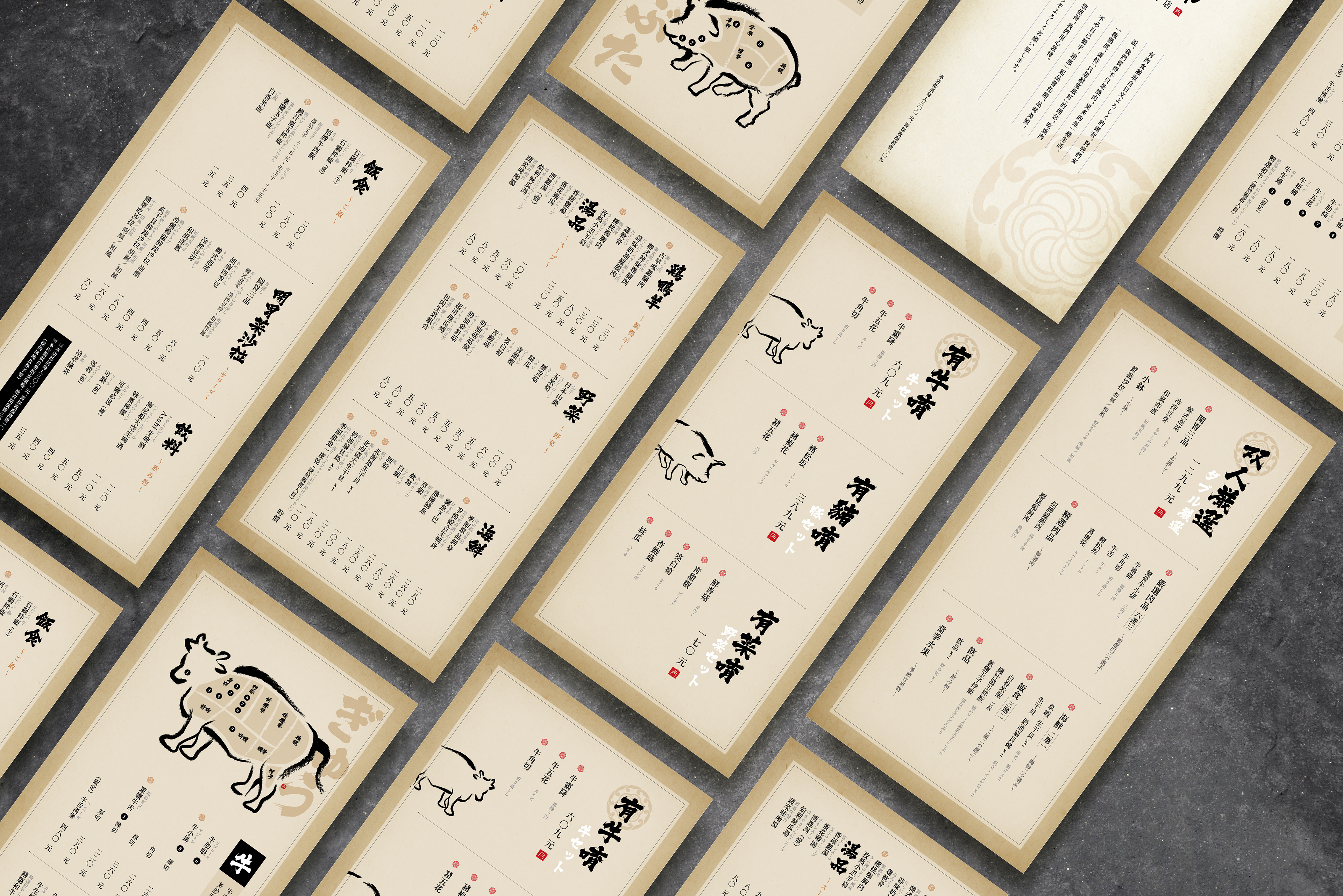
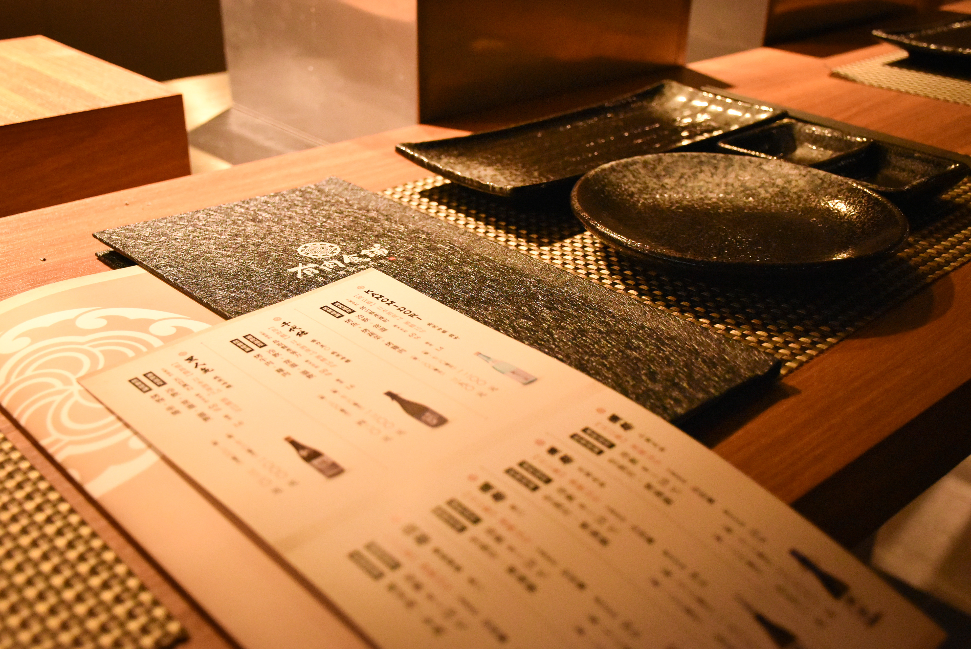
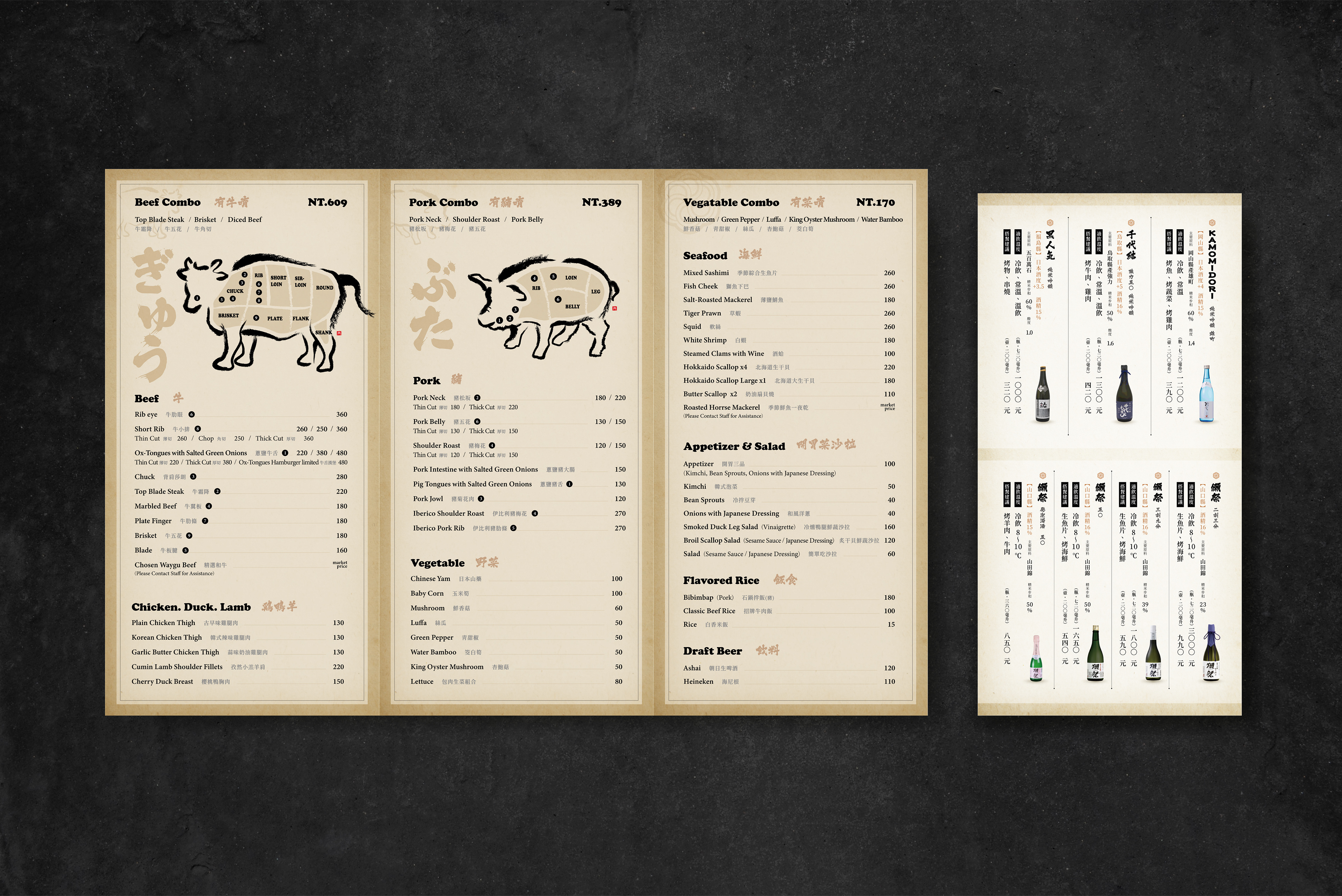
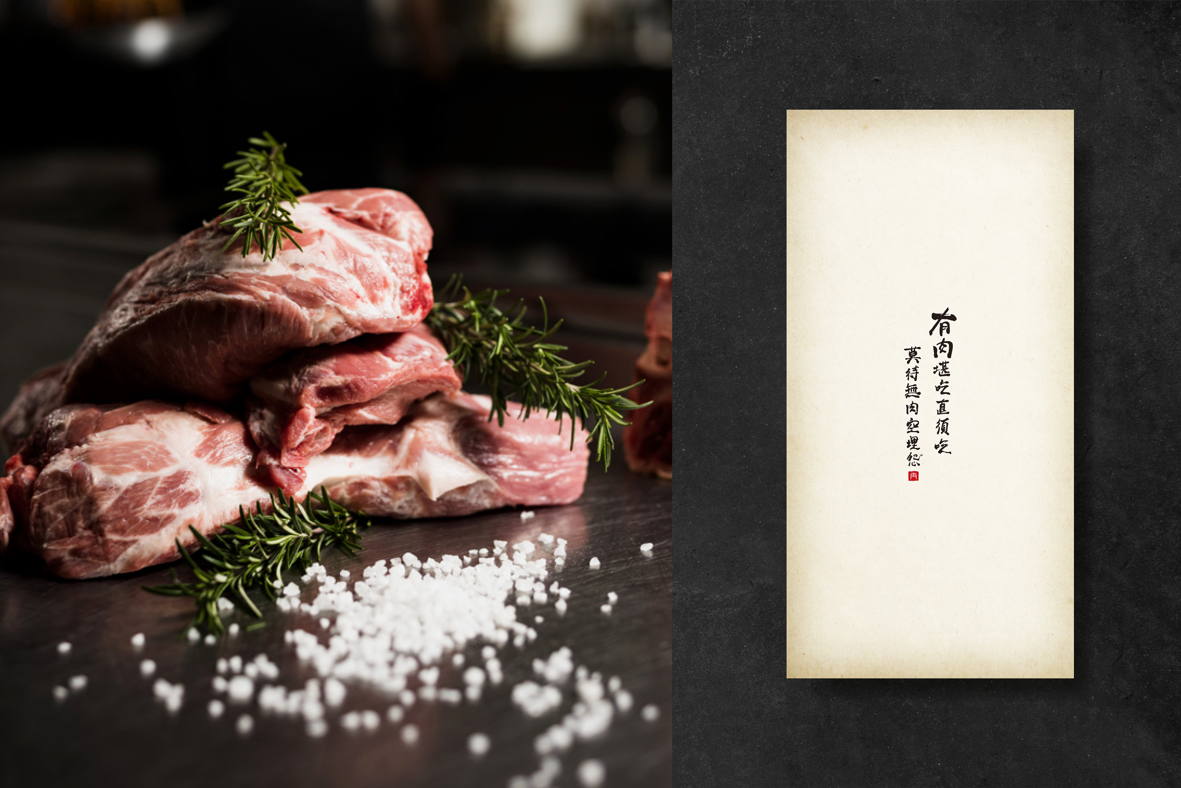
有肉食舖 炭火燒肉專門店取自日文「よろしく」請多指教的諧音,是一間日式燒肉店。透過專業的代客烹調,讓每一種肉品皆能以最適當的火侯、熟度呈現在顧客面前。讓每一位顧客能完全享受用餐的愉悅氣氛,不需動手,就能享用美味好吃的燒肉。
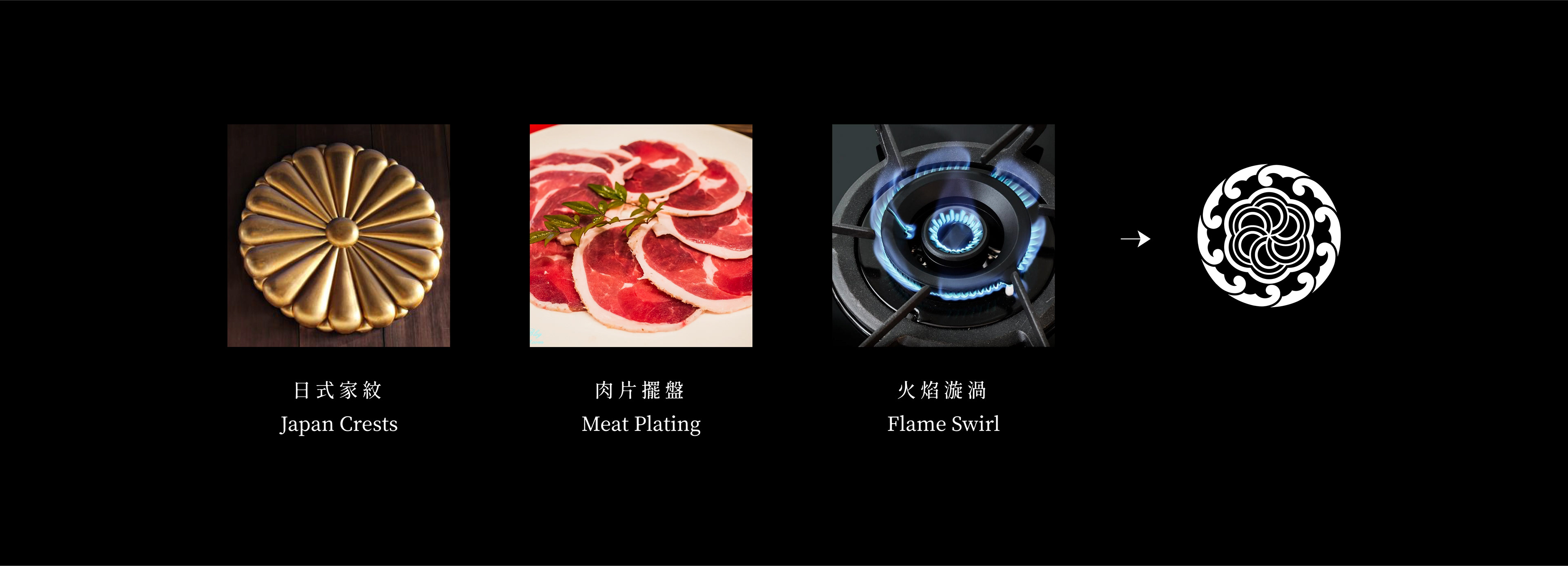
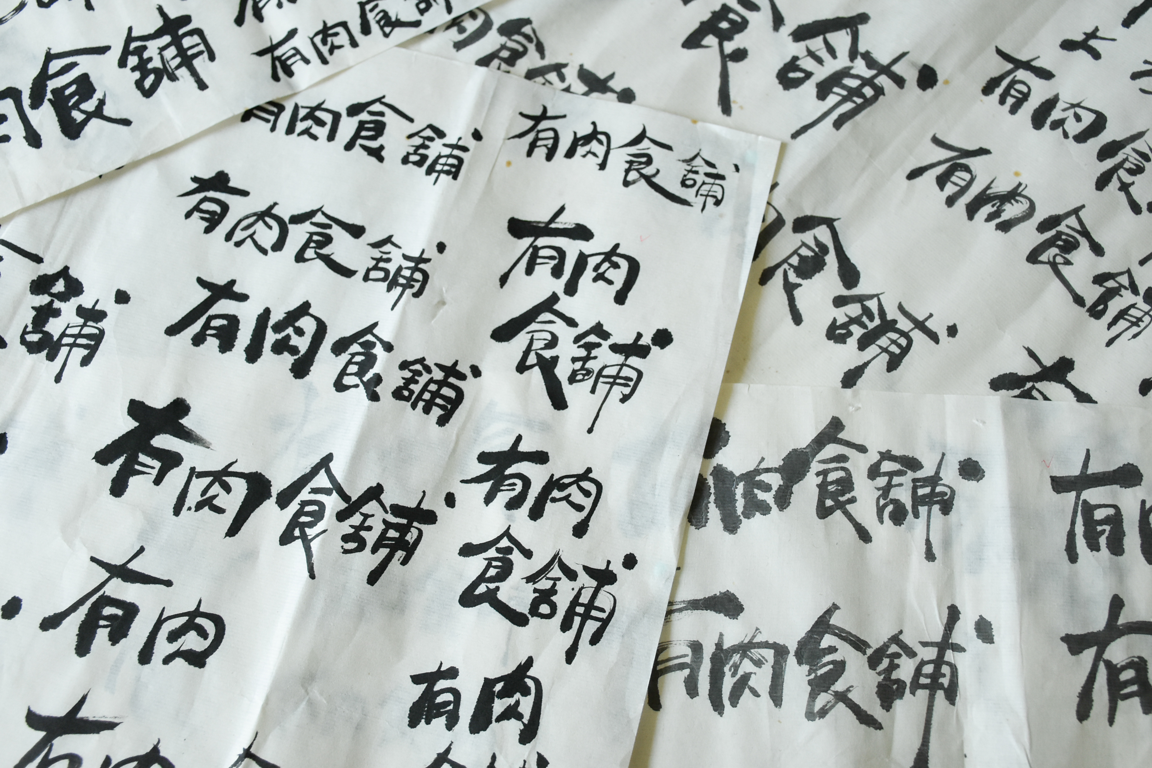
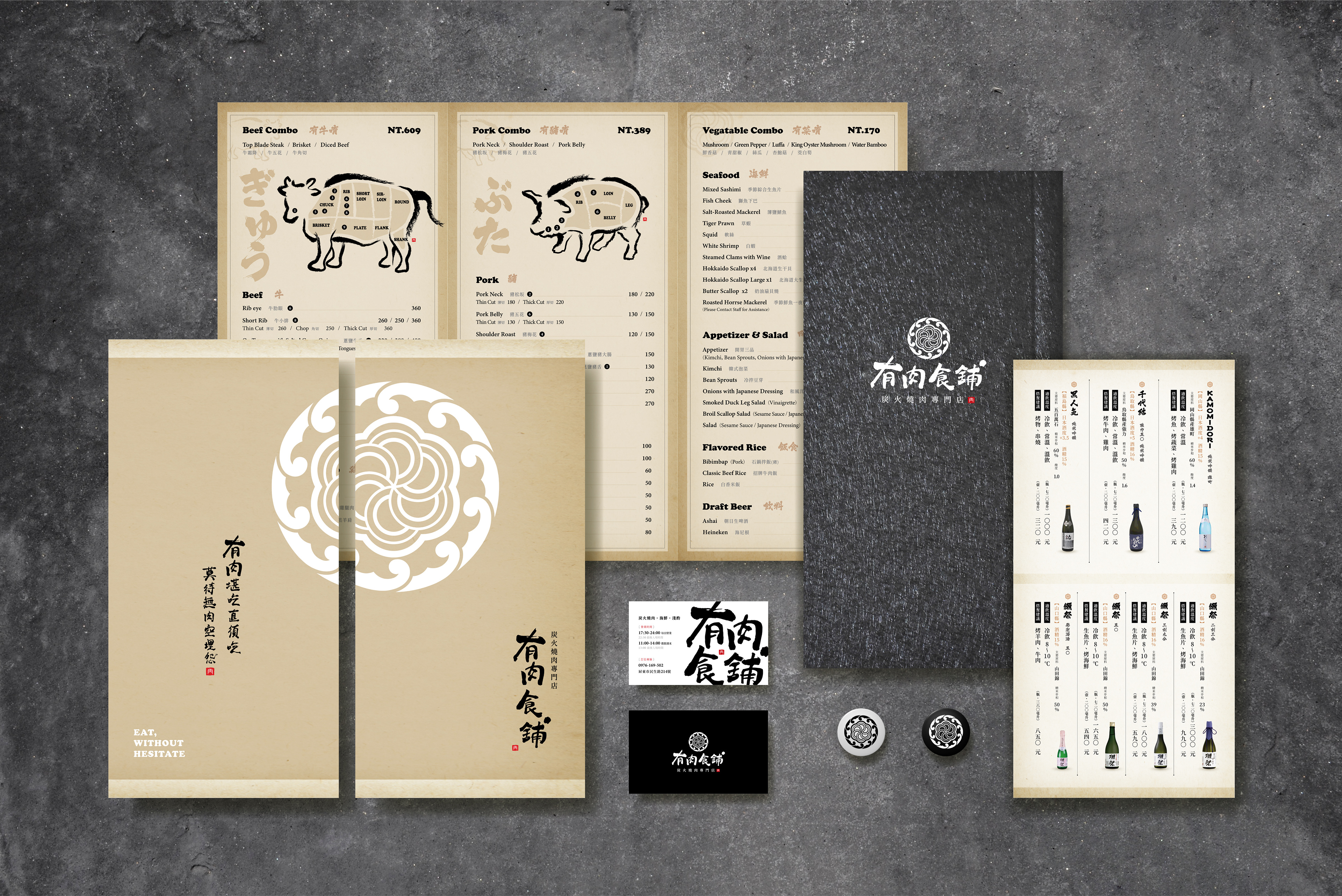
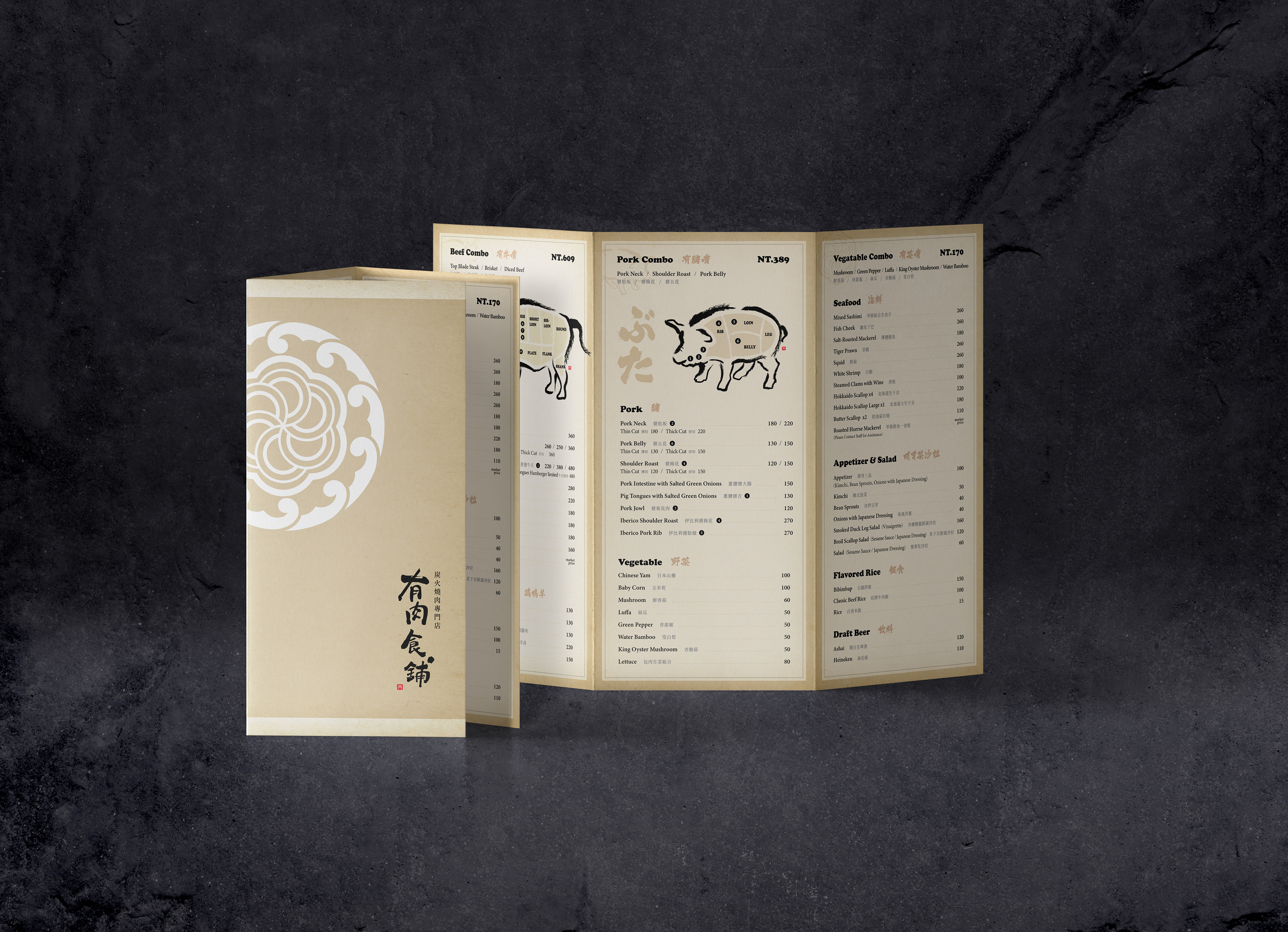
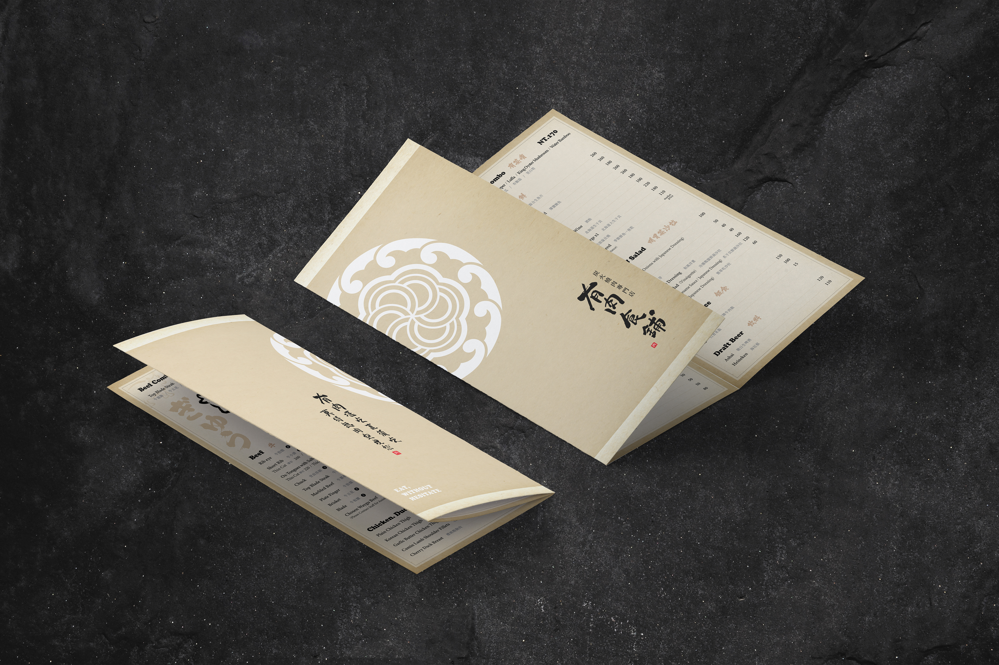
品牌設計以「職人燒肉」為出發點,以日本特有家紋形式傳達專業精神,並呈現出肉品燒烤時的樣態:標誌外圈造型參考日式圖樣「波紋」,象徵火焰燃燒;內圈造型為重疊的同心圓,呈現肉品擺盤時的層疊豐富。肉的諧音又同數字「六」,故以六個圓增強印象。字型設計上為了平衡家紋的嚴肅感,選用手寫毛筆字,透過較隨性、活潑的運筆,和不刻意修飾的飛白,傳達出輕鬆、自在的品牌意象。
Yoroshipu, derived from the pronunciation of Yorosiku, a of how Japanese people showing their modesty when serving, is a Japanese grilled restaurant. Each kinds of meat are well and properly cooked with the aid of professional chefs, so as to make every customer enjoy the delicacies and the pleasant ambience of the restaurant.
The logo thus is designed according to Japan Crests, representative of the profession spirit as well as the aspects of grilled slices. The swirling fringe of the crest is designed based on the concept of ripple, symbolising the flow of flame, while the overlapping circle in the centre indicates the multiple layers of meat plating. Besides, meat in Mandarin is pronounced as “rou,” similar to the sound of “liu,” number six in Mandarin; that said, the logo consists of six circles to reinforce the concept of plating. With the writing brush font, the seriousness of crest has been softened, in order to convey the compatibility and vigorousness of the brand.