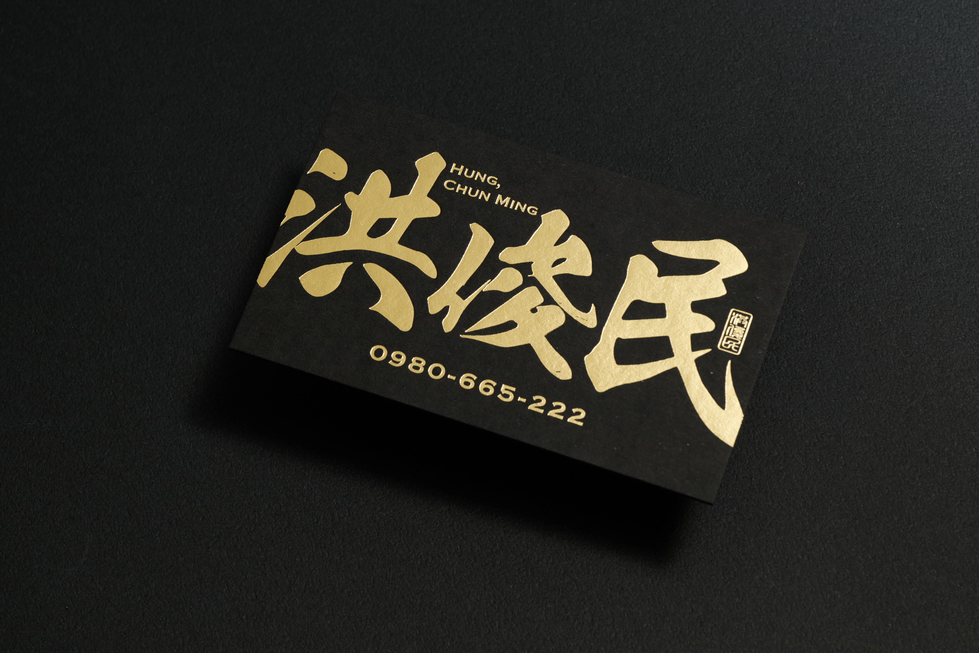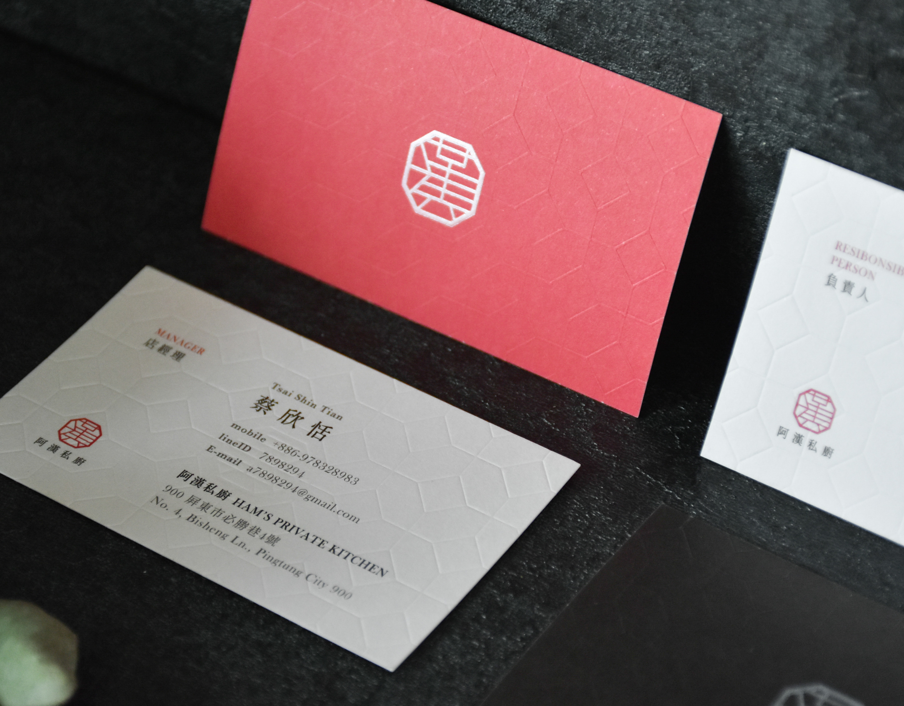
洪俊民 名片設計 Business Card Design
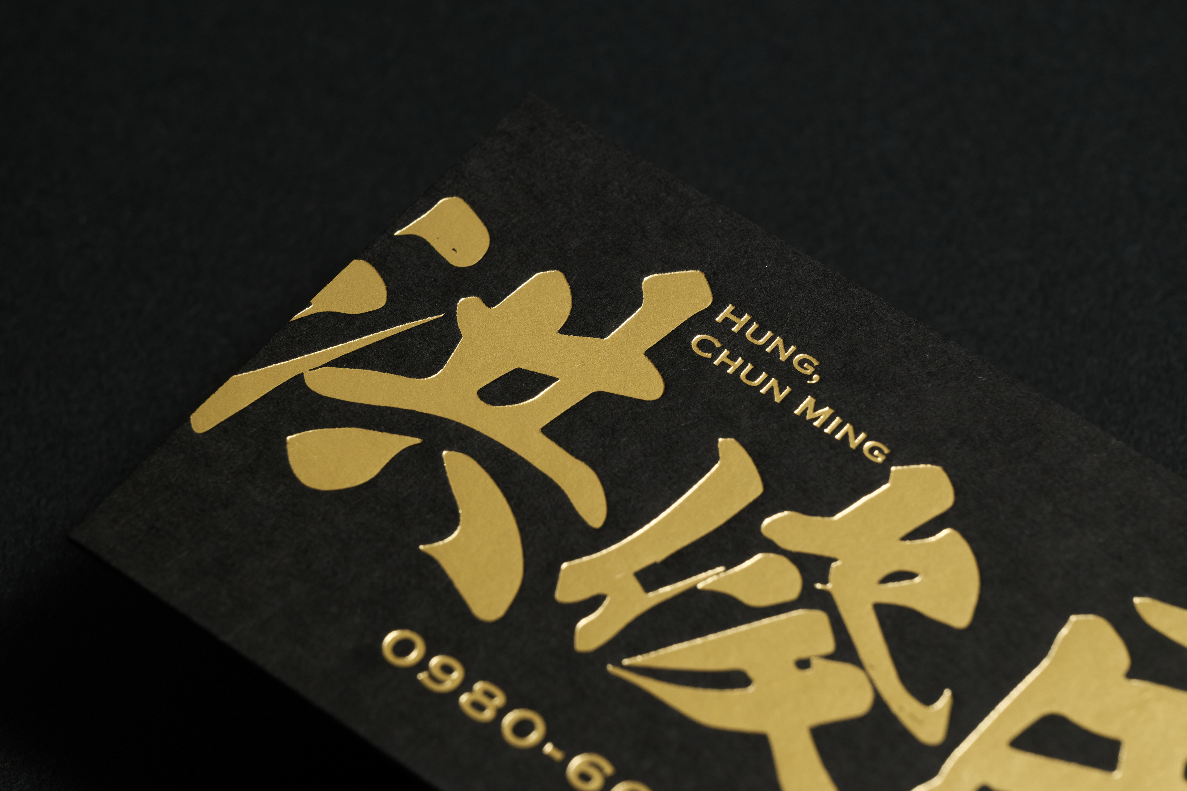
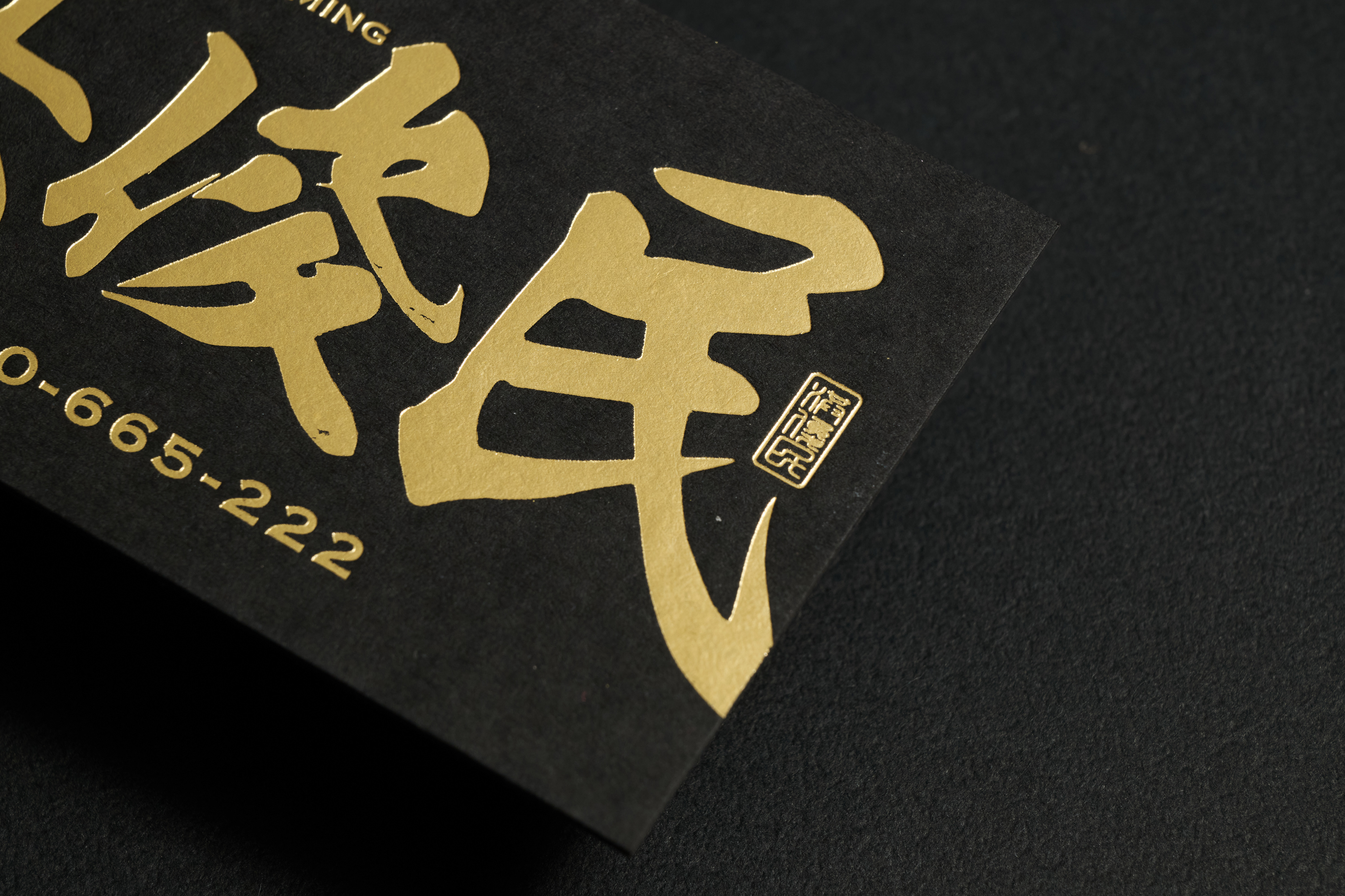
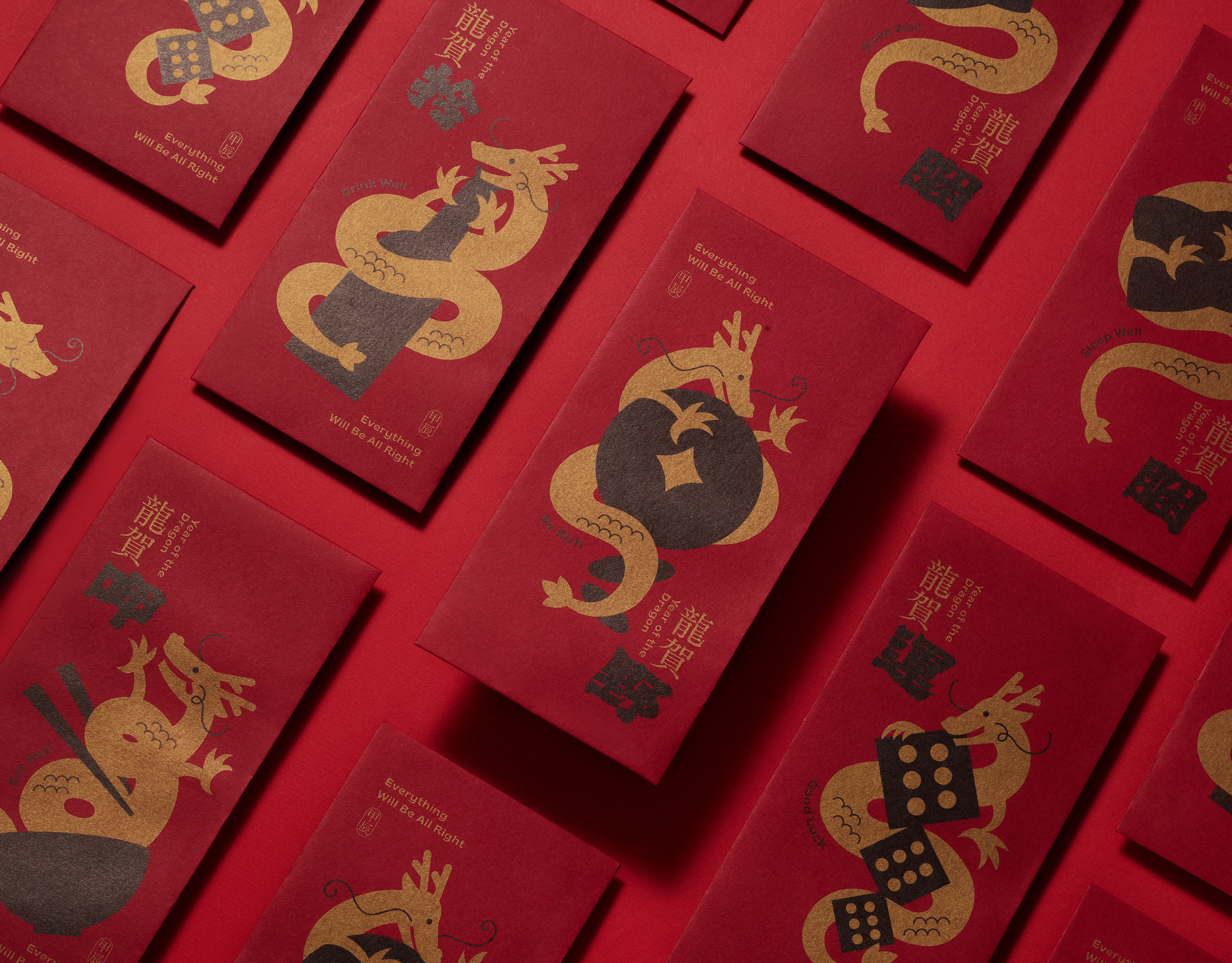
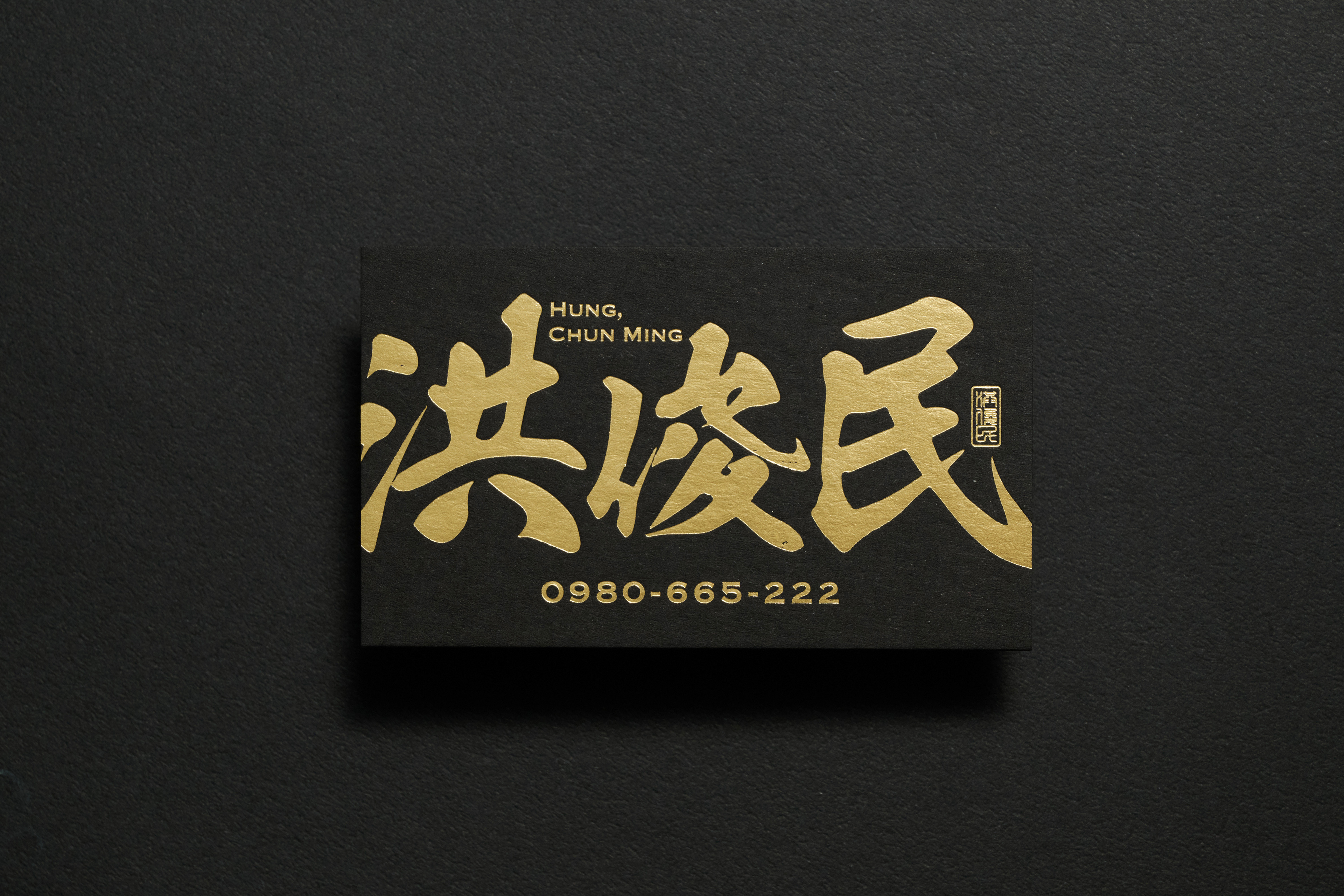
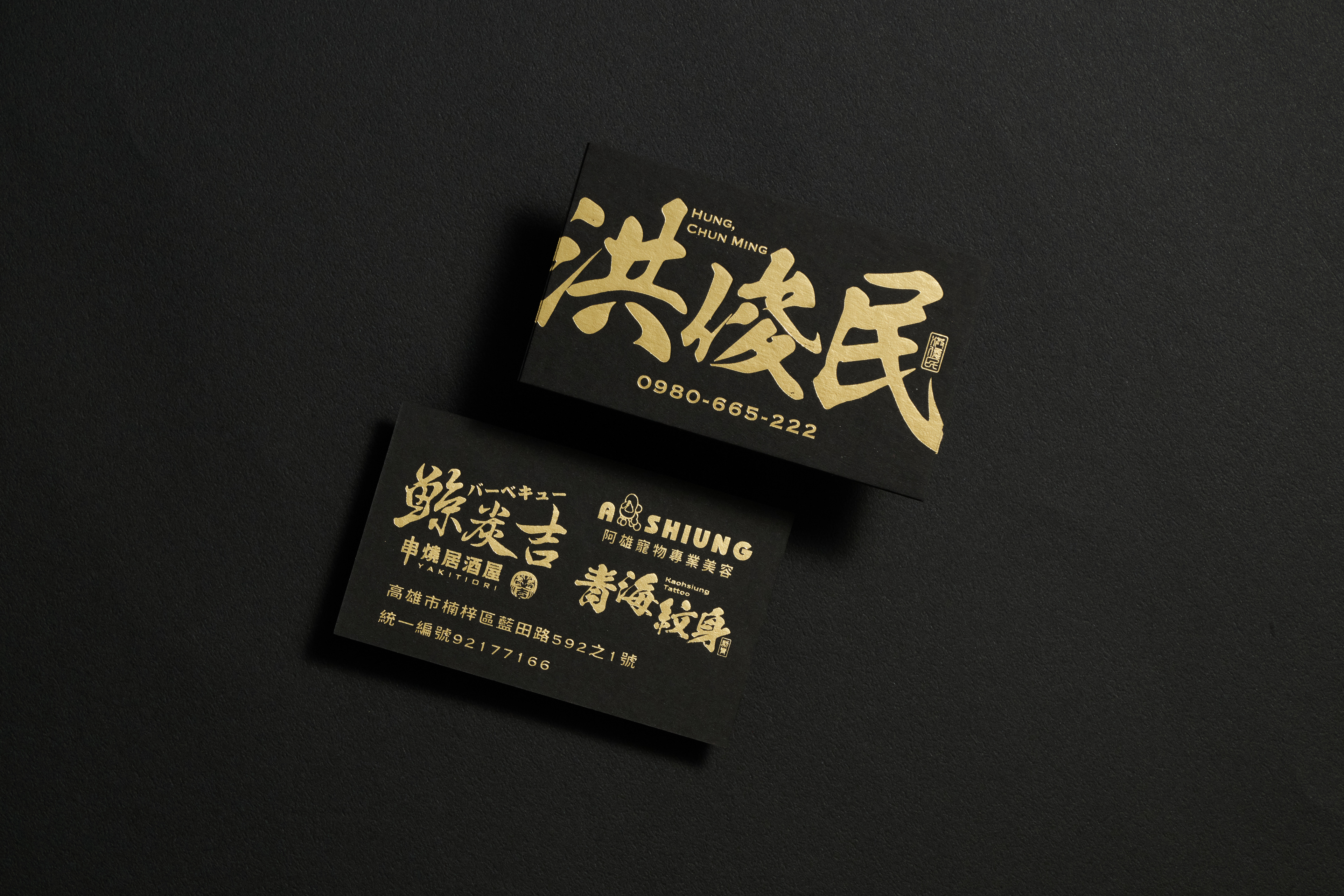
此名片設計以磅礡大氣的視覺語言傳達專業與自信。以深黑為底、搭配金屬燙金字體,形塑出如碑刻般的厚重氣勢。整體設計在簡潔中展現力量,透過極少的元素讓焦點集中於名字本身,彰顯品牌與個人的強烈存在感。
選用高磅厚卡紙材質,不僅在手感上強化份量與層次,也讓金箔在燈光下呈現出細膩的光澤變化。字體設計上採手寫筆勢風格,筆畫轉折間保留勁道與氣韻,展現出專業與個人風格兼具的精神。
整體設計以厚實、俐落、沉穩為核心,象徵穩健的基礎與堅定的信念,讓每一次名片的遞出,都是一場關於氣度與印象的延伸。
This business card captures a sense of power and presence through bold contrasts and refined material. Gold foil on deep black conveys strength and sophistication, while the thick cardstock enhances its weight and tactile depth.
The calligraphic typography carries motion and authority, combining tradition with modern precision. Clean yet commanding, the design leaves a lasting impression—each card an expression of character, confidence, and class.
Visual Design Ting-Shan Lin
Photography Yi-An Chen
Year 2024
Print 慶三堂
Paper 黑騎士 480g